A Map of Every Tornado Since 1950

As part of development at the Esri R&D Center in DC, we've been working on new ways to visualize large amounts of data on a map. Large datasets present several challenges. Simply how to render that much data is one issue, but also how do we visualize large datasets when throwing millions of a points on a map no longer makes any sense to the end user. We want to look at a map of data and understand something about that data immediately.
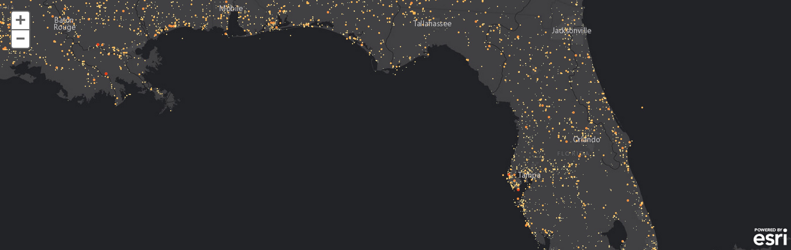
Weather offers an incredible variety of large datasets to explore and understand, and thus are often used in experimenting. Severe weather records, specifically tornadoes, extend back to 1950 for the United States, with over 58,000 tornadoes now in the Storm Prediction Center database. Traditionally, rendering all 58k points would be too heavy for a browser to handle. In order to create a map of all the tornadoes on record, we're creating tile cubes, which allows us to efficiently render to canvas.
With that said, we think this map is mostly just cool, as showing 58k points on a map cartographically is not necessarily helpful. The sliders, however, allow you to narrow in on a timescale, or visualize all 58k tornadoes all at once.
The data visualized are provided by NOAA's Storm Prediction Center and the Tornado History Project. Data on tornadoes extends back to 1950, with 58,047 tornadoes visualized on this map. Click the legend histogram to filter by tornado Fujita scale, use the slider above the legend to change the time range. Dragging the right circle all the way to the right side will show all the tornadoes at once.
View the full version of this map here.
Find Chris Helm on Twitter @cwhelm or myself @brendansweather with questions!