How might the new NOAA climate temperature normals change for your county?

We're almost one month into 2020, and this is an exciting time for climatologists. Upon the completion of this year, calculations will begin to update the climatological normals. Wondering what those are? Well, any time you hear your local meteorologist mention the average for the day, or see headlines like "temperatures much above average" or "expect drier than average conditions," that average is based on climatology that has been calculated, using the most recent 3 decades, by NOAA's National Centers for Environmental Information.
Our averages are currently based off temperatures and precipitation observed 1981-2010. After the end of this year, the new averages (or normals) will be for the period 1991-2020 (basically we're dropping the 1980s and adding the 20-teens). Why update the normals? Well, whether you think climate change is human caused or not, we all agree that the climate is variable. It's important to make sure that we're accurately representing the current climate when talking about what's "normal."
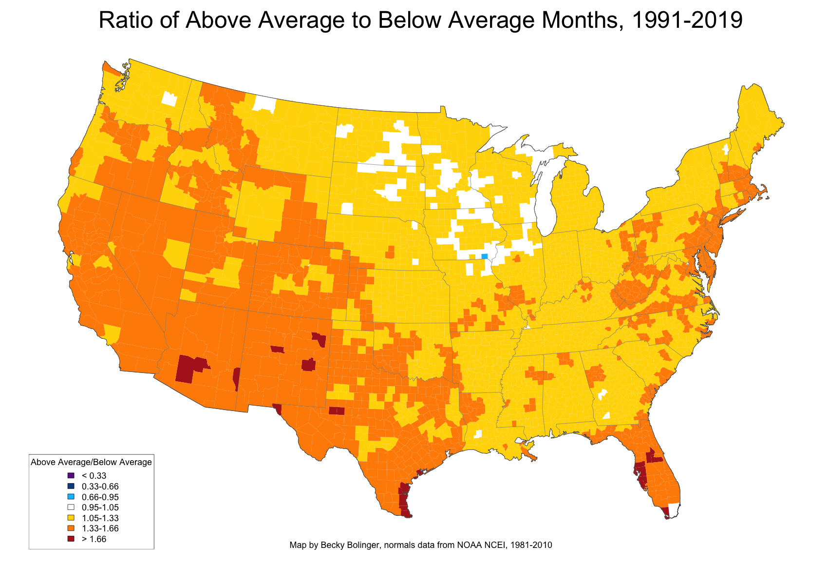
If weather conditions were truly random and the variability around the average never changed, we could assume to experience an equal number of above average or below average conditions. Like flipping a coin, we'd expect, with enough coin tosses, we'd have an equal number of heads and tails. Have we experienced the same number of above average temperatures vs. below average temperatures? Take a look at the map below (number of above average months vs. below average months for the 1991-2019 period) to see that, simply, the answer is no. If the data were truly randomly distributed, we'd see mostly white on this map (i.e. the ratio between above average and below average conditions would be 1 to 1). Overwhelmingly, most of the counties show a ratio greater than 1.

Areas in blue would indicate that we see a greater number of cooler than average months compared to warmer than average months. Notably, there is only one county, in Iowa, that comes up blue. And only a small handful of counties in the upper Midwest that are near 1.
Warmer colors indicate more warmer than average months have occurred. Areas in orange show counties that have observed 33-66% more warmer than average months than colder than average months (i.e. for every 3 colder than average months, you could expect 4-5 warmer than average months). Most of the southwestern counties are orange. A handful of counties - located in Arizona, New Mexico, Texas, and Florida - have a number higher than 1.66.
So, comparing to the 1981-2010 normals, we see that for most of the country there have been a higher number of warmer than average months from 1991 to 2019. Does this mean we'll see higher averages when the 1991-2020 normals are calculated? Let's see what things look like when we break it down by month.
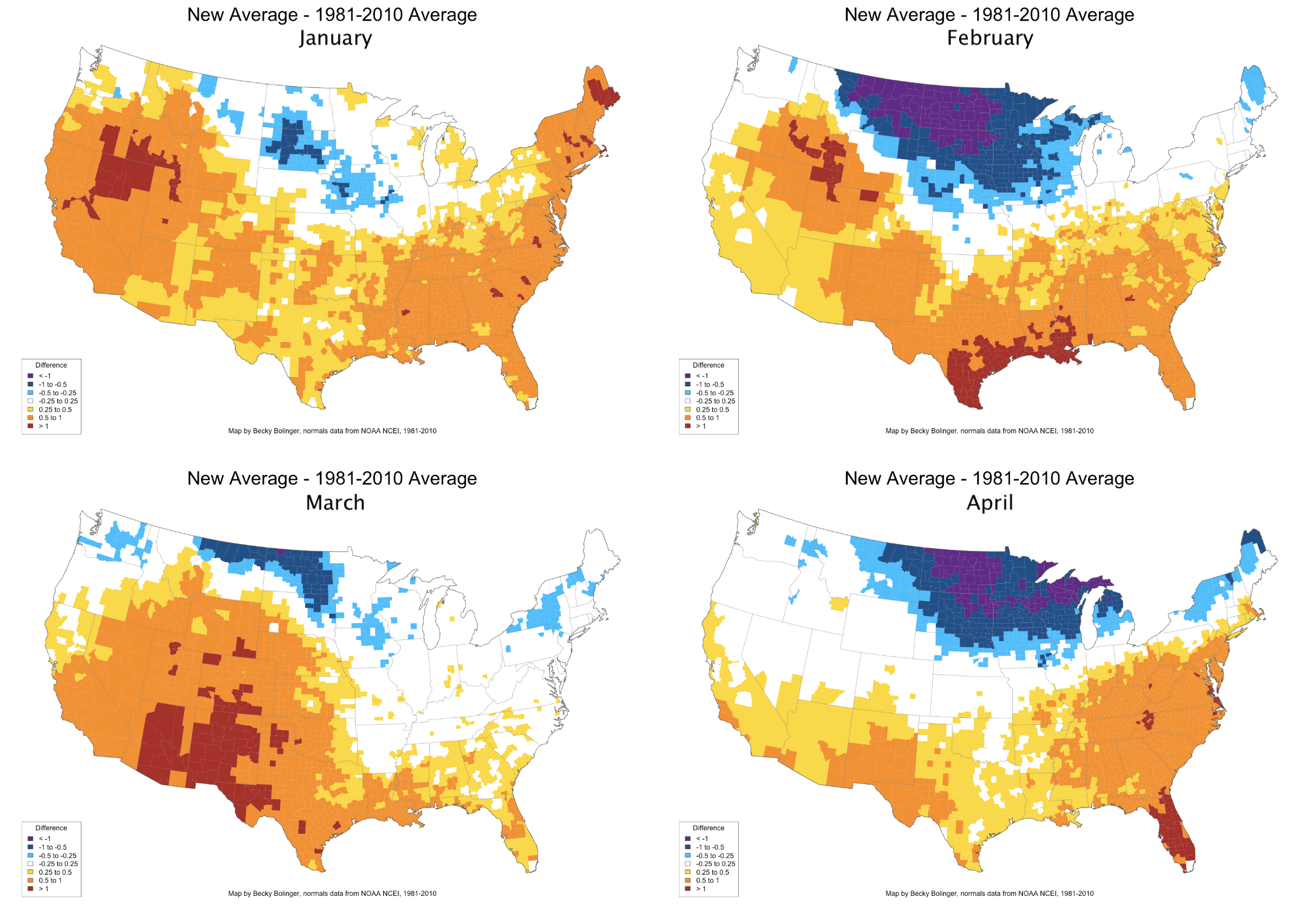
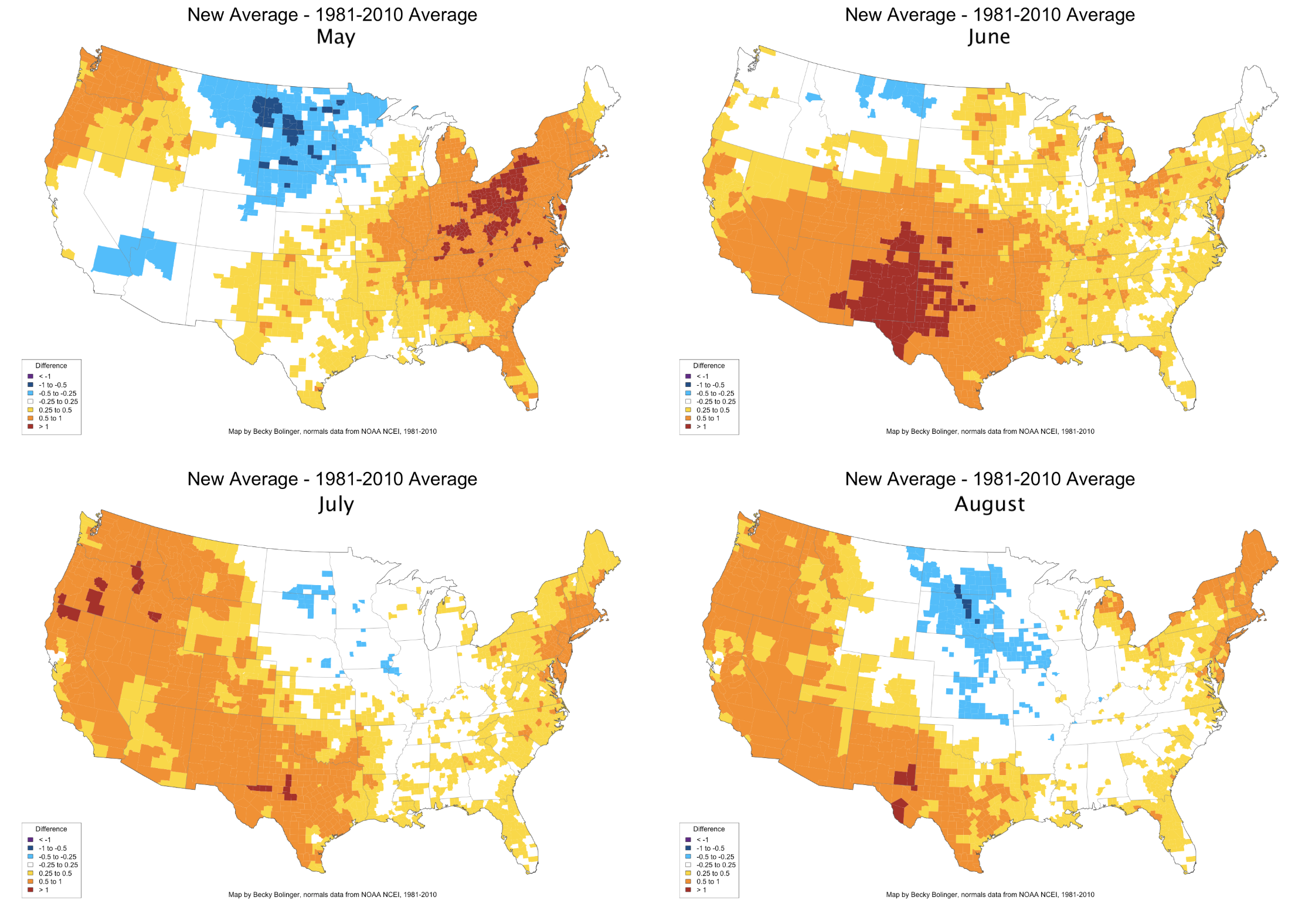
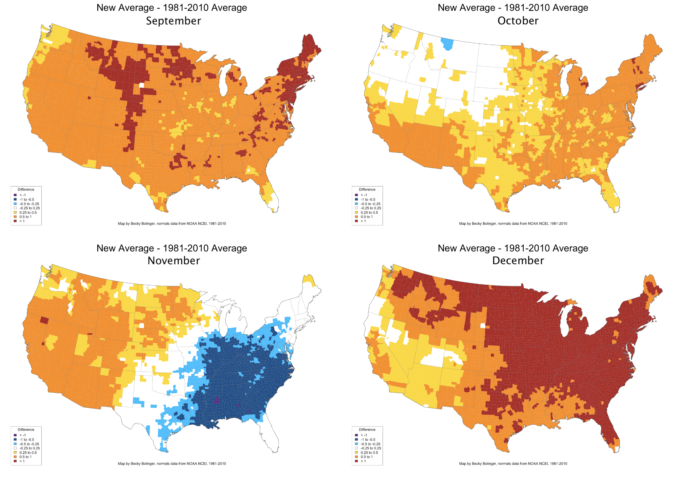
For each month, I'm estimating what the new average might be by calculating the mean of the observations for 1991-2019 (caveat: obviously we still have one year to go, and also NCEI does additional calculations to smooth data, remove biases, add/remove stations, etc. Meaning, what I've estimated here is not necessarily going to match exactly what the new normal becomes). Some very interesting patterns emerge:
- In the cold season months, monthly averages through much of the upper Midwest will be cooler than the current average. In fact, from January - August, there is very little warming observed between the two averaging periods for a lot of the central to northern plains. It's speculated that this is linked to agricultural and irrigation practices throughout the region (wetter soils will prevent the air above it from warming as much).
- For the southeast, we can expect to see cooler averages estimated in the month of November. This is possibly driven by a significant increase in fall precipitation over the southeast.
- Widespread warmer averages can be expected across the U.S. during September and December. While the warming looks more extreme for December, the difference there is largely due to dropping a couple of extreme cold months in the 1980s. For September, there is quite a significant and consistent amount of warming occurring, especially in low temperatures.
- August is the month where we would expect the least changes for much of the country. This makes sense if you consider that August is the warmest month for much of the northern hemisphere, so there's "less room to grow" so to speak.
What changes can you expect where you live? The following is a breakdown of monthly changes we expect to see, with links to interactive versions of each map below. Interested in precipitation changes? Stay tuned, we'll be adding a precipitation analysis soon!
If you'd like to explore these monthly maps interactively, you can find them here (April is embedded, others linked below). And be sure to zoom out to see changes for Alaska (spoiler alert: there are some major changes happening there!).